ADDICTIONS.COM
DESIGN SYSTEM & UX+CRO STRATEGY
Date: Feb 2022 - NOV 2022
Skills: UX / UI / CRO
Tools: Figma / Hotjar / VWO
Teams: Product / Front+Backend
Project Summary
This effort involved a comprehensive analysis of existing pain points and areas requiring enhancement within the current design. Our pursuit led us to devise various solutions, culminating in a novel design that not only mitigated these issues but also ushered in a smoother, more enjoyable user experience. The outcomes of our efforts heightened call rates and positive feedback from site visitors, signifying an improved user journey. In this case study, I demonstrate the roadmap of my design process and explore the impact of these enhancements from both a user experience and technical standpoint.
This is a design case study encompassing the transformation of addictions.com, involving strategic UX enhancements, UI refinements, conversion rate optimization (CRO) initiatives, and rigorous A/B testing. Our mission was to revamp and elevate the user experience, with a primary focus on amplifying call conversions.
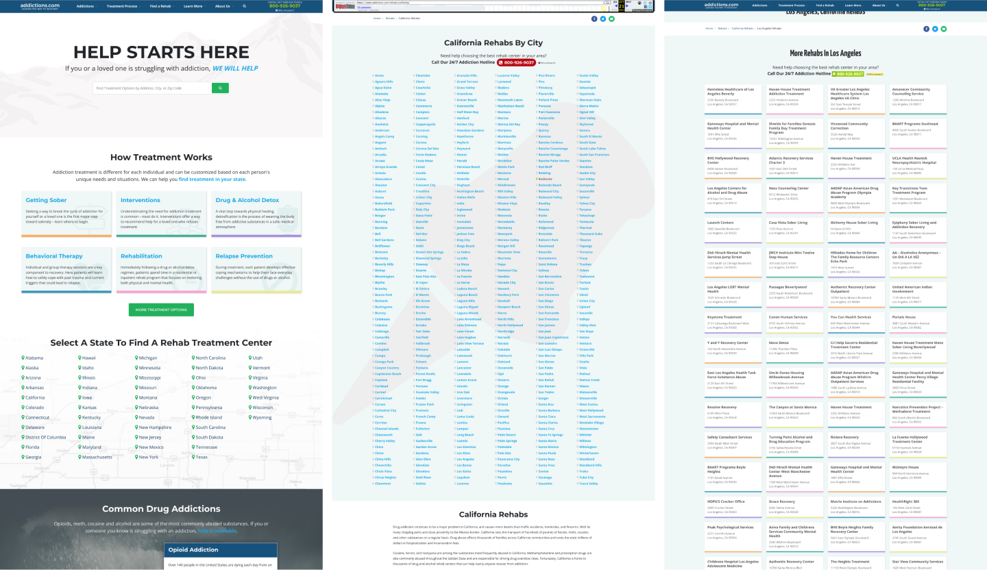
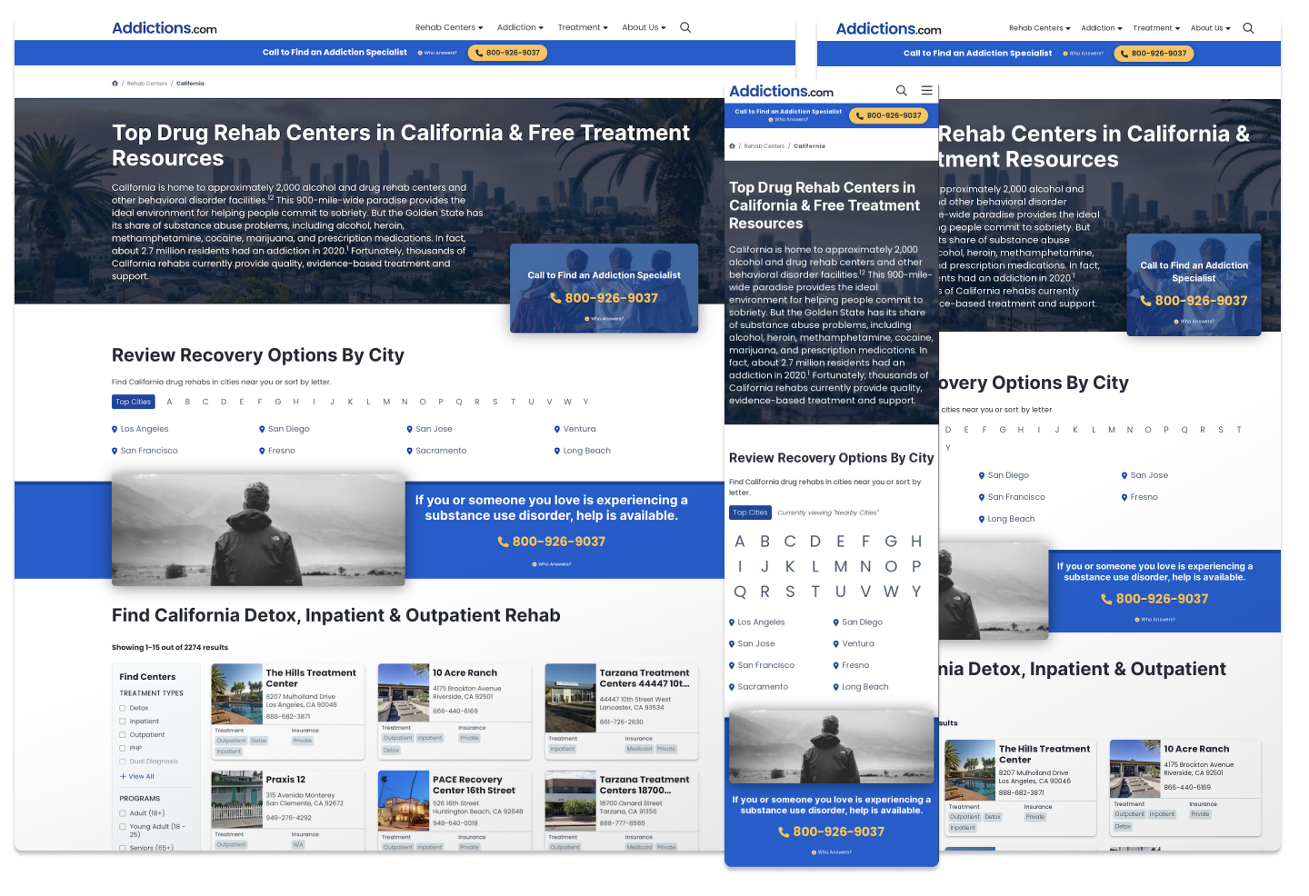
The Old Addictions Page Templates
- Home Page
- State Page
- City Page
HOW MIGHT WE
I started by using the "How Might We" method, which is a simple framework for generating successful ideas. This method consists of three phases: 1. Identify, 2. Understand, and 3. Execute. In a nutshell, this method helps teams recognize, assess, and prioritize problems and solutions. I turned each problem into a question, which then led to actionable solutions for the team to work on.
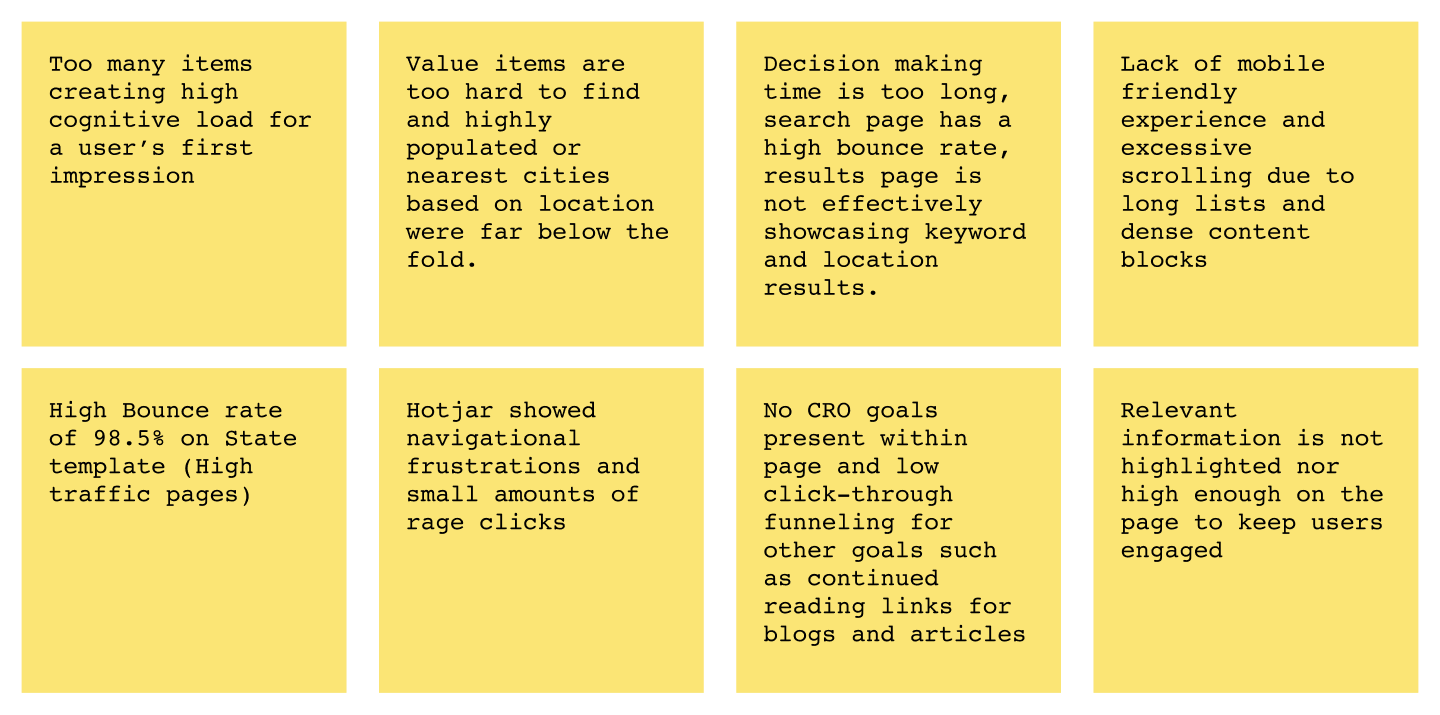
1. Identify
In this phase, I aimed to identify obvious UX pain points and issues with more complexity. After writing out many problems, the team and I voted on prioritizing 8 of the issues to move them along to the next phase. One of those issues included a high bounce rate on the State page template.
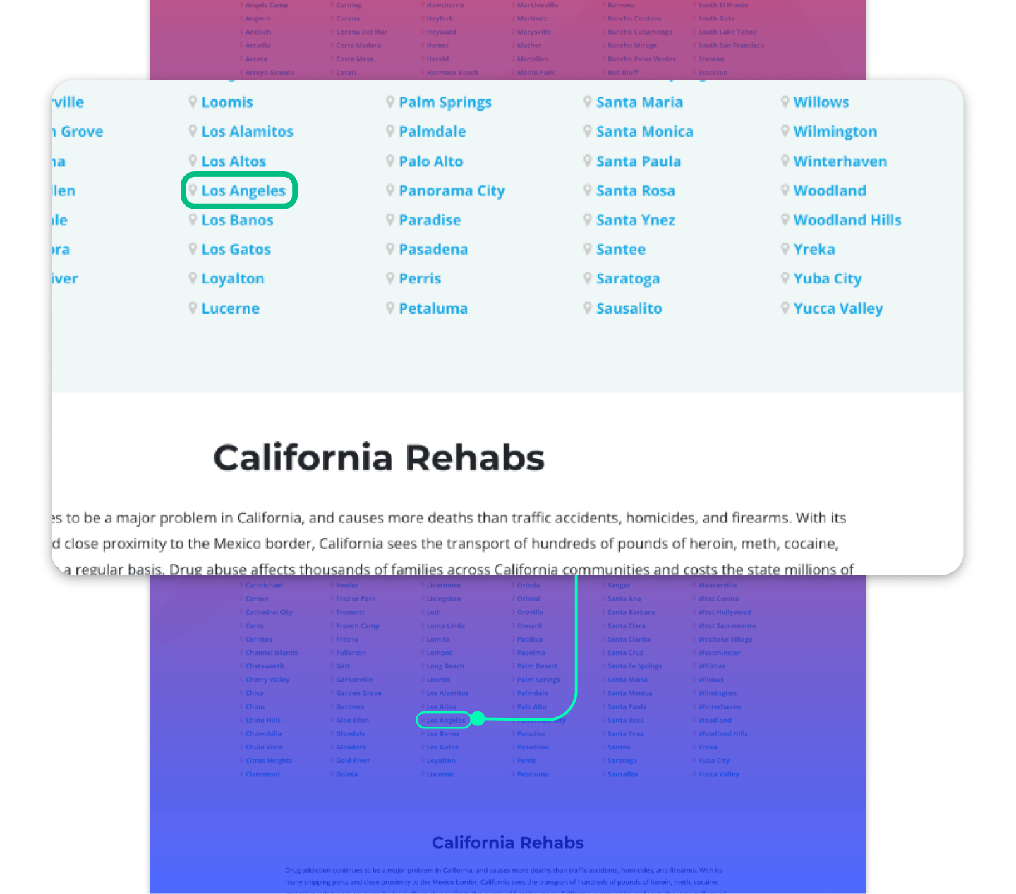
Example of A High Value Item Difficult to Find
2. Understand
When we formulated these problems into questions using the HMW (How Might We) method, prioritizing goals became clear. The team started to understand the weight of these concerns. It allowed us to obtain realistic expectations for the items completed during Q1.
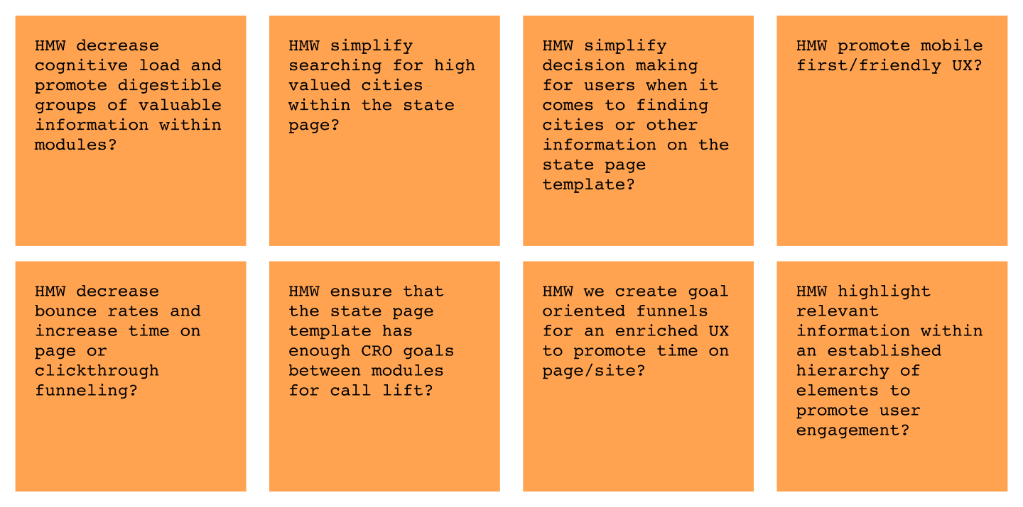
3. Execute (Deriving Solutions)
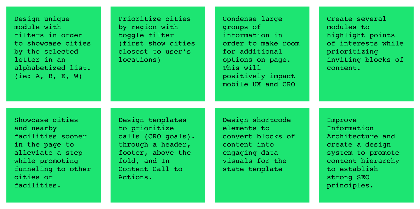
After voting on the items with reframed questions, we decided as a team to determine what would be executable during Q1 and Q2. When we voted, we agreed to complete the items below and then regroup to assess future projects in Q3.
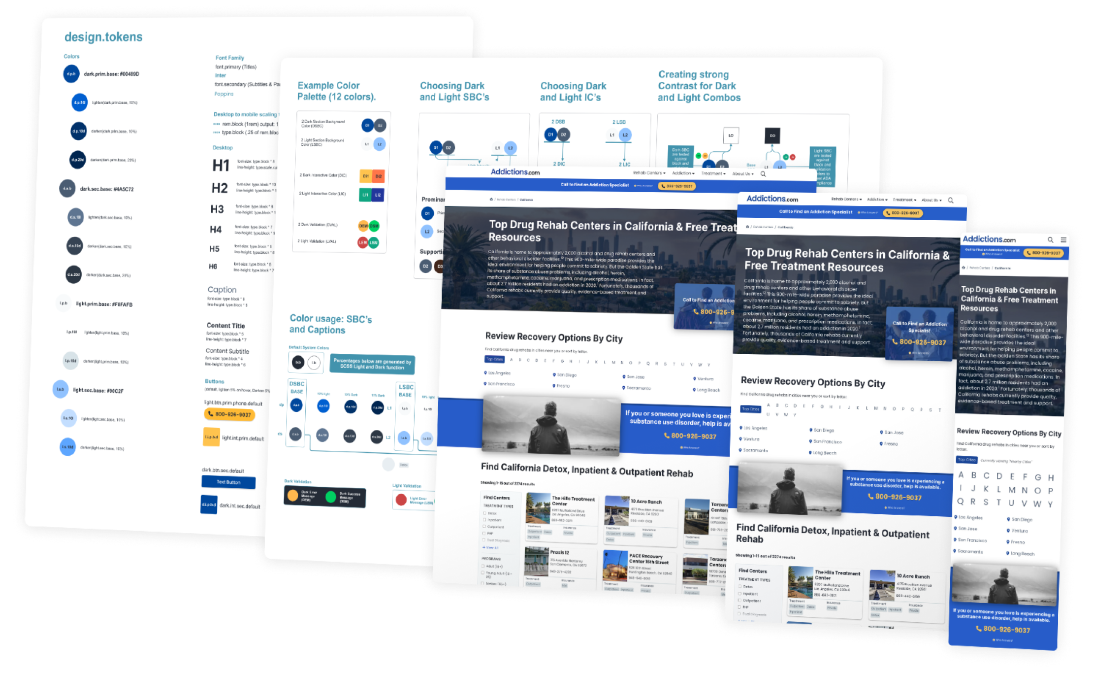
Establishing a Design System
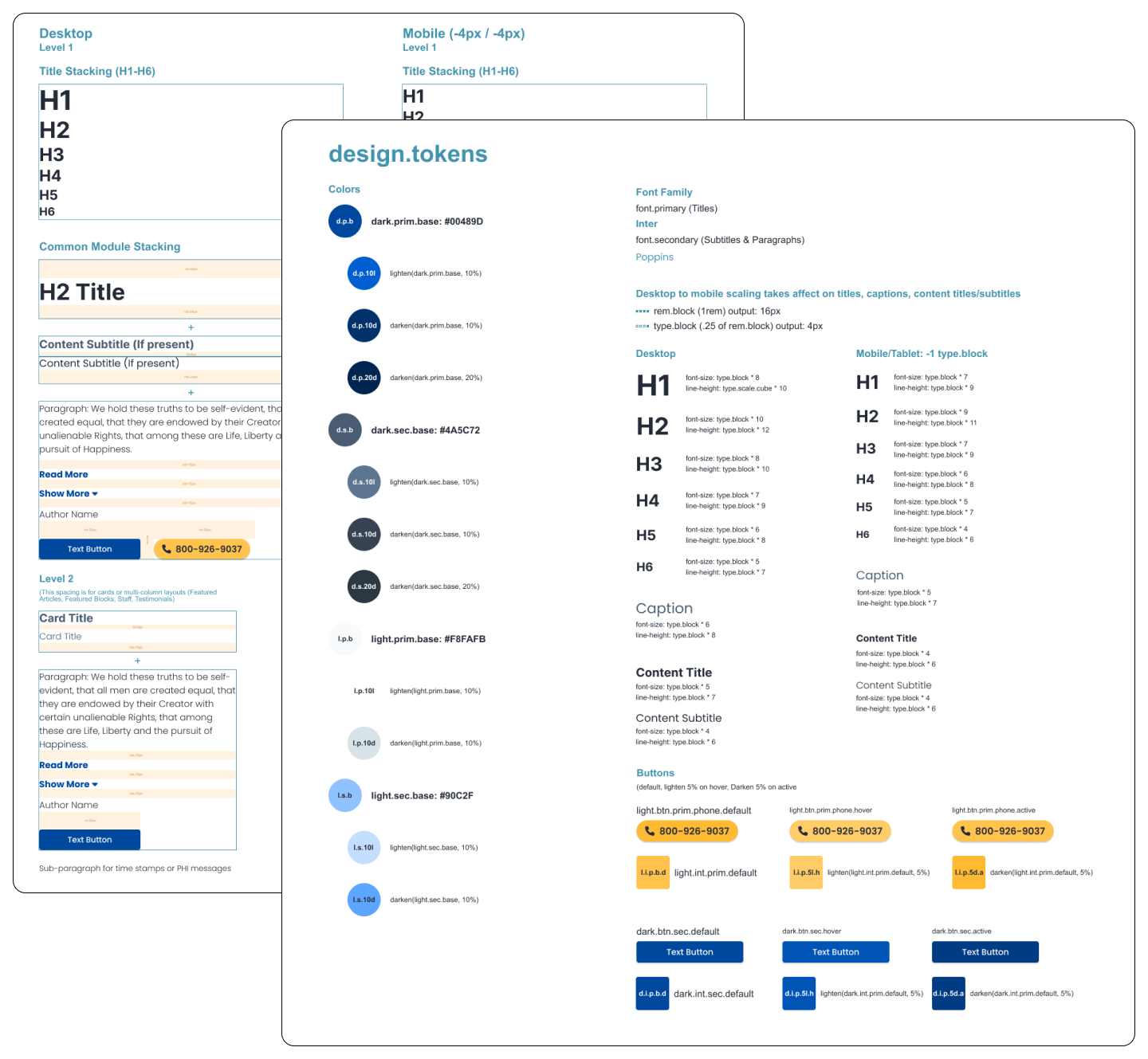
Design Tokens, Scale, and Stacking
I started by creating a design system to support the new brand. I first selected primary and secondary brand colors to represent the new theme. Then I used SCSS functions to derive dark and light variations of the primary colors and translated them into design tokens. I implemented a typography token called type.block in order to divide up 1rem (16px) into 4px blocks for precision. It allowed us to define the responsive typography for different screen sizes.
The design system also established predefined margins and scale for all elements. I created instructions for component stacking to quickly build modules or blocks of content utilizing order for text elements such as paragraphs and buttons.
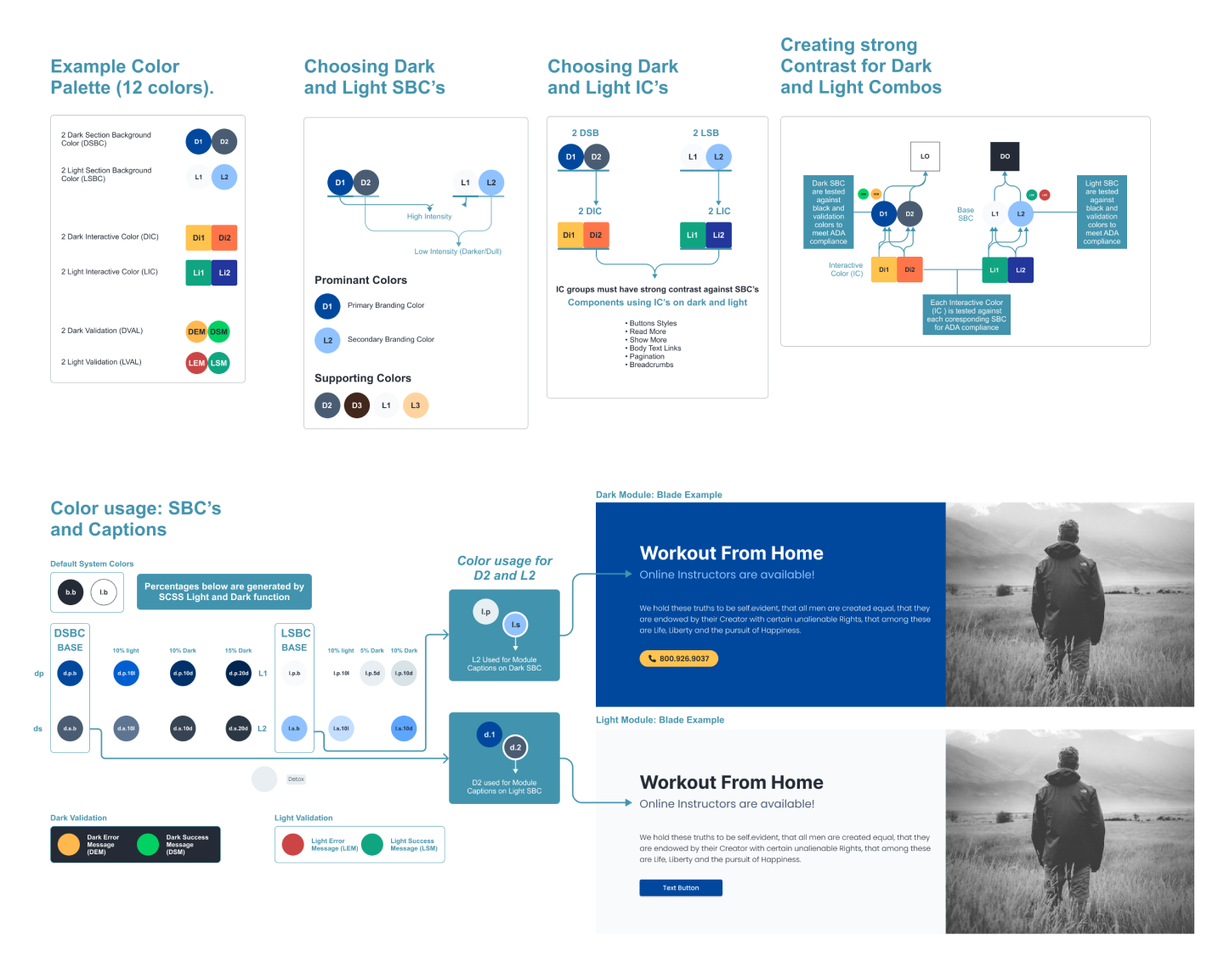
Color Logic and ADA Compliance
I then created color logic and mapping to separate dark and light colors. I achieved ADA compliance by classifying Section Background Colors (SBCs) and Interactive colors (ICs) within a module. The diagram below shows the relationship between those color groups. In other words, the diagram instructs that dark text (elements with D0) cannot coincide with a module containing a dark section background color. That would result in conflicting logic and poor contrast for the user.
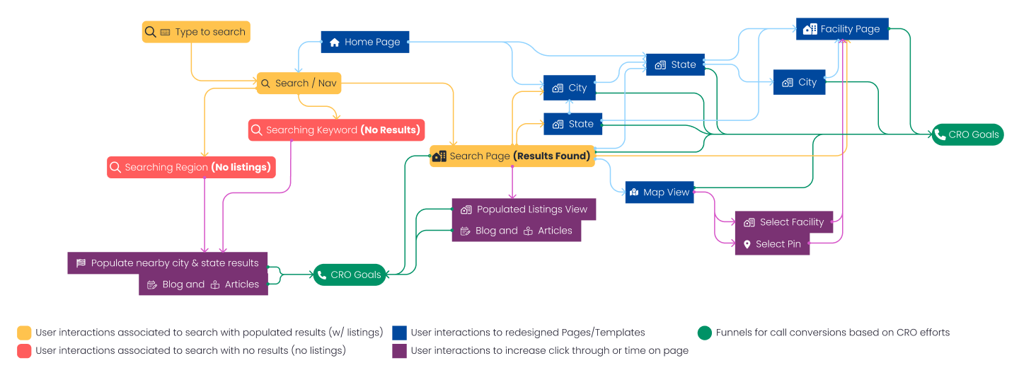
User Flows and CRO FUNNELS
I created a diagram to indicate the user flows and page types for various scenarios to determine search types. The diagram instructs the developers to differentiate keyword search results against location results (state/city). I ensured each of these result types carried CRO opportunities. The rehab listings were still being updated and continue to be updated. We prioritized call opportunities for visitors that could not find rehabs within 25-50 miles.
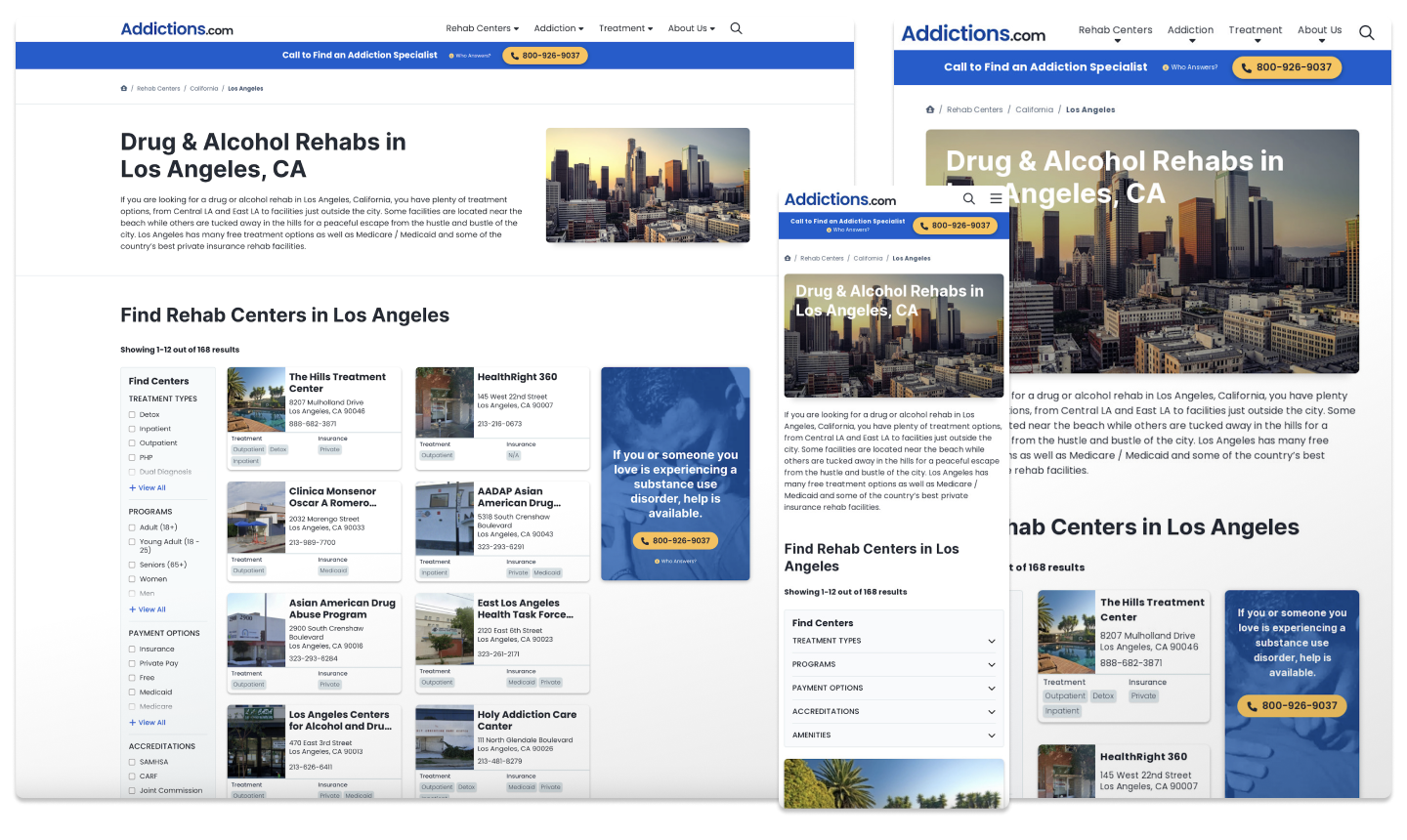
Wireframing the New State Page
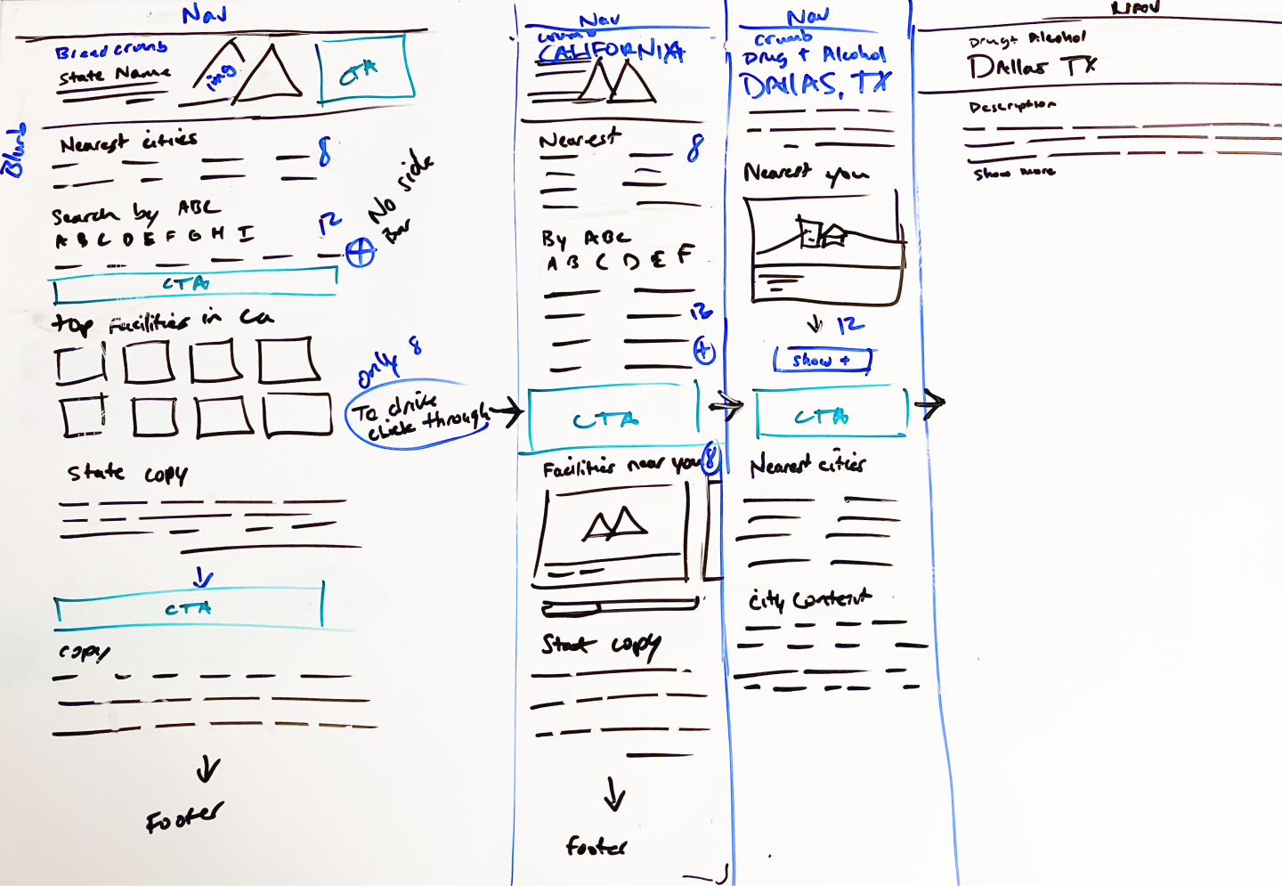
Here is an example of the wireframing that took place as we moved quickly to redesign and develop the state page template for all 50 states. I established CRO goals and strong positive UX patterns by condensing information to locate rehab facilities nearest to the user.
Designing Unique modules for each Template
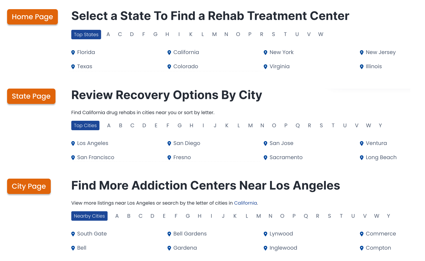
I designed three filter types with unique messaging for each template to increase click-through. I created default toggles to promote top states/cities or nearby cities upon page load to showcase the state/city nearest to the user. In addition, our internal population count determined which state/city is present in the module. The toggle by letter allows users to find a rehab in their desired location and creates room for CRO goals.
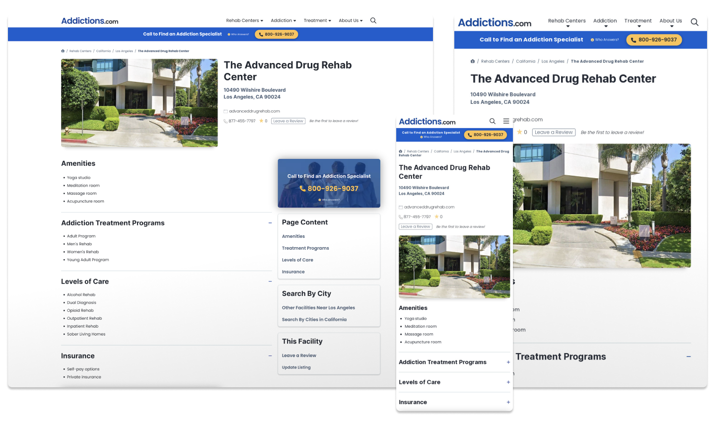
Page Templates for Redesign
- Home Page: Improve SEO and market credibility
- State Page: CRO, UX, listings
- City Page: CRO, UX, listings
- Facility Page: CRO, UX, facility, and categories
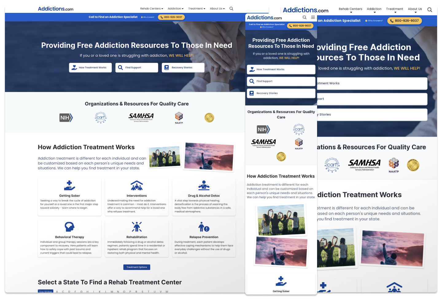
Home Page Redesign
State Page Redesign
City Page Redesign
Facility Page Redesign
CRO / VWO
I established 9 CTAs for CRO and A/B testing opportunities. Since the previous templates from the older design did not have CTAs in effective locations, I ensured that the new page templates had CTAs above the fold and between large content blocks to break up the dense text.
Tests Types Conducted on VWO
- Multi-variation Testing
- Placement Testing
- Animation Testing
- Content/Messaging Testing
Boiler Plate CTAs
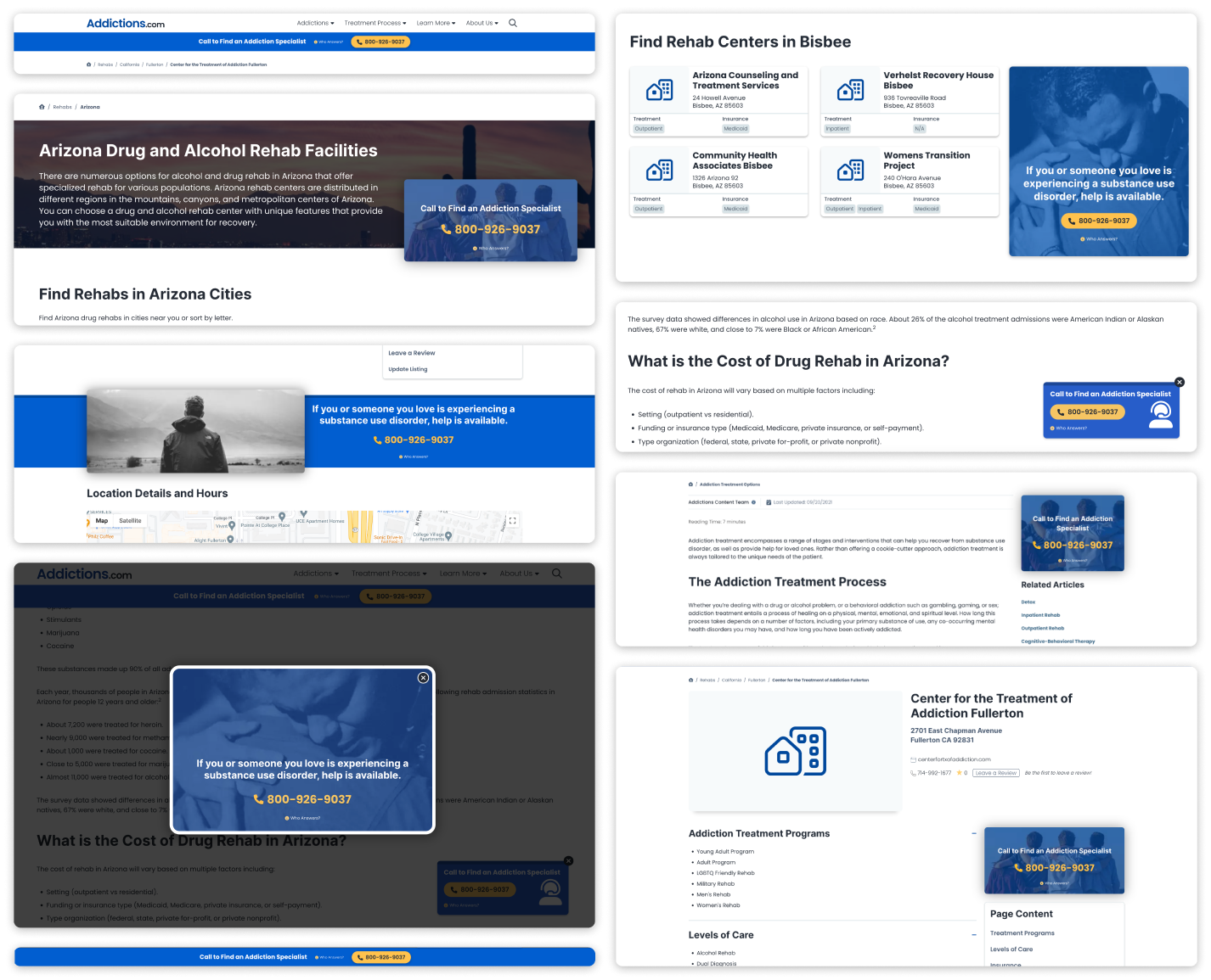
Column 1
- header-sticky-cta
- state-banner-cta
- in-content-fullwidth-cta
- modal-cta
- footer-header
Column 2
- listing-results-follow-cta
- floating-cta
- sidebar-article-cta
- sidebar-facility-cta
Shortcode Content enhancement
I designed a dynamic shortcode system to support data visualization and user engagement. This effort allowed the content team to highlight specific points of interest like statistics and graphs, which improved lists and blocks of content to become more enjoyable for the user. I also coded a copy-and-paste library for anyone involved to use shortcode types with modified attributes. These attributes allowed for customization like 2-4 column layouts.
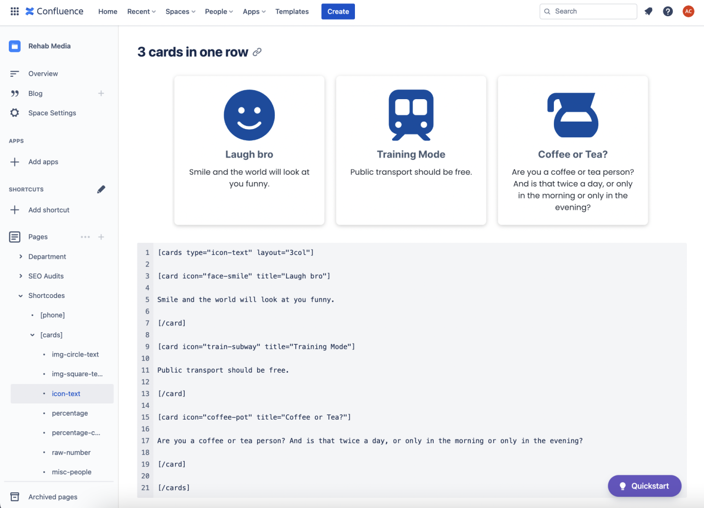
Shortcode Types:
- Images
- Lists
- Square Img Cards
- Percentage Img Cards
- Icon Cards
- Raw # Cards
- Medical City State Templates
Outcome
In conclusion, this redesign set a foundation for fulfilling profitable business goals. Since the redesign aimed to improve mobile UX, we increased call lift by ensuring that CTAs were prominent in the mobile experience. The secondary objective fulfilled in this effort was to improve SEO ranking. Since the new site emphasized better information architecture and updated content placement, our SEO rankings and time-on-page improved.
- Calls increased
- Improved UX
- Decreased rage clicks
- SEO ranking improved
- Traffic improved due to Content Strategy
- Time-on-page increased due to improved click-throughs.
- More engagement with content visualization