PAGE LAYOUT EDITOR 2.0
A DEVELOPER ORIENTED DESIGN SYSTEM
Date: July 2020
Skills: Product / UI Design
Tools: Sketch / CSS
Teams: Product / Front+Backend
1. IDENTIFY THE PROBLEM
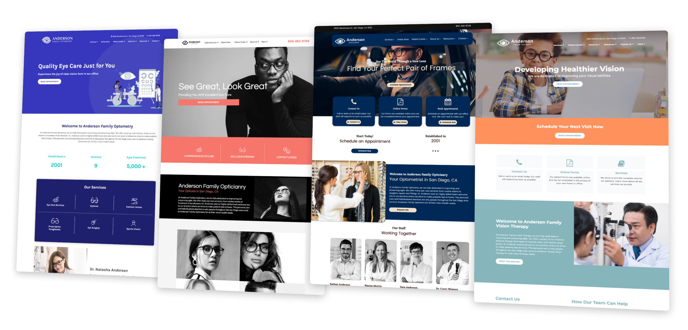
What is Page Layout Editor (PLE)? PLE is a CMS/Web builder designed specifically for health and legal services such as optometry and law firms. PLE allows customers to quickly build webpages with 30+ modules to showcase information such as location, hours, staff members, or photo galleries.
I performed a UI audit and found that PLE had spacing and alignment inconsistencies within many modules and elements. There were modules with unaccounted behavior along with excessive styles to shared components within the CSS. This negatively impacted hundreds of existing custom themes and any future themes that would use the pre-existing PLE version (1.0) to run their websites.
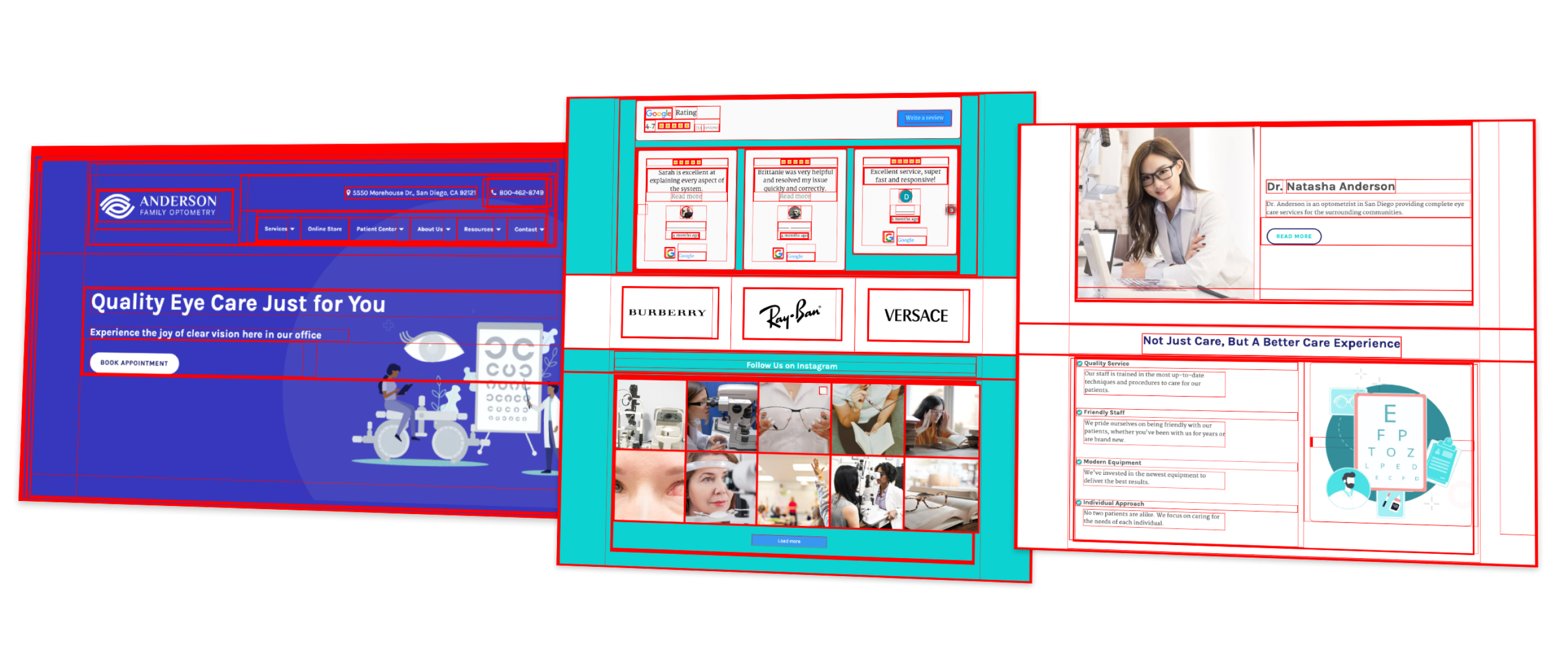
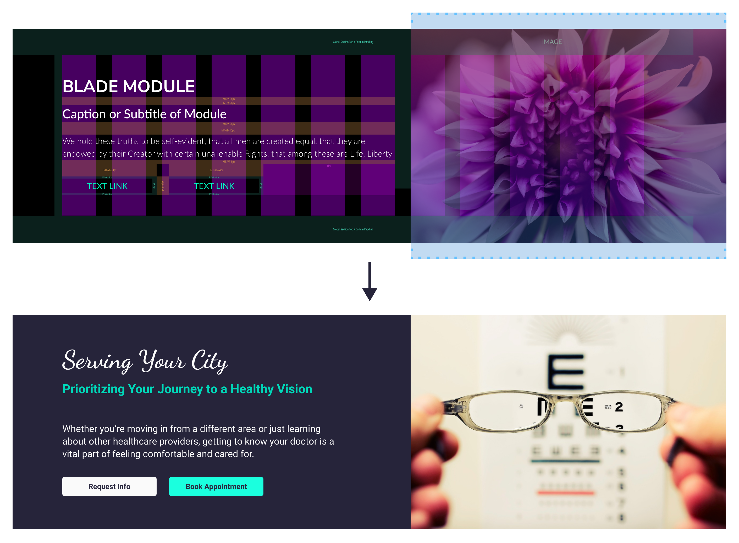
In the provided illustration, I applied various CSS values to emphasize the framework of each component, employing a red border. This approach facilitated the identification of areas requiring enhancement, such as element overlap or undesired spacing discrepancies. The highlighted purple segments serve as clear instances of inconsistent margins. This comprehensive audit unveiled instances of undefined CSS attributes and the absence of a preferred spacing standard, such as the widely recognized 8-point spacing system (multiples of 8px).
2. UNDERSTAND THE PROBLEM
I realized the importance of including module specifications to clearly demonstrate the intended behaviors, including typography and scaling, default flex properties, margin and padding variations, stacking orders, and more. These specifications are essential for effectively communicating module settings and behaviors to users.
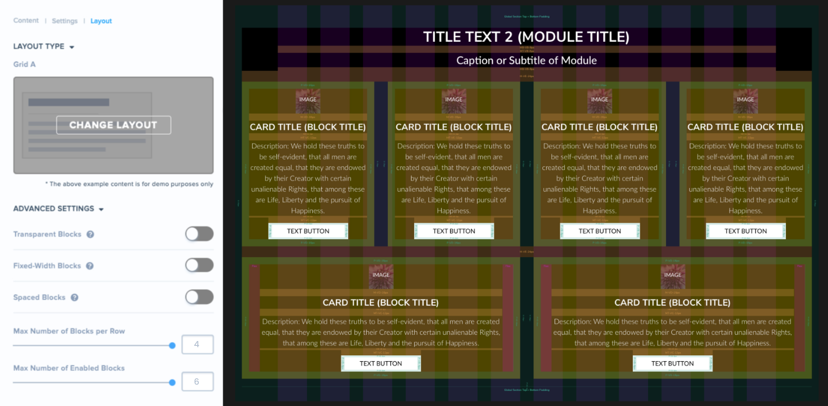
Featured Blocks Settings: As shown in the image above, the Featured Blocks Settings allow users to specify the number of featured blocks displayed within each row. I chose to define the conditions and collaborate with developers to establish the logic and constraints necessary to maintain legibility and behavior for each block. For instance, in cases where the bottom row contains only two blocks, it was crucial to define the card min-width and the width of container within the card to ensure that description components remain narrow and legible.
3. Execution: CREATING PLE 2.0
In my role as the lead designer for this project, I provided guidance to two design teams consisting of eight designers each. Together, we focused on component utilization and adhering to design standards to produce wireframes for all 72 module layouts. Additionally, I established a style library within Sketch, and as we progressed, we implemented Abstract for version control. Below, you will find the comprehensive list of all the module layouts we reconstructed.
Header
- Logo
- Navigation
- Phone
- Search
- Search Bar
Footer
- Copyright
- Disclaimer
- Social Media
Homepage
- Banner A
- Banner B
- Banner C
- Banner D
- Banner E
- Banner F
- Call to Action
- Interactive Blocks
- Featured Block Flyup
- Featured Block Grid
- Featured Block Grid A
- Featured Block Grid B
- Featured Block Grid C
- Featured Block Grid D
- Featured Block Grid E
- Featured Block List
Article/Blog
- Article Categories
- Article List
- Article Page
- Blog
- Blog (Recent Blog)
- Blog Categories
- Featured Articles
Informative
- Before
- Blade
- Breadcrumbs
- Editable
- Fixed / Custom Module
- Hours
- Legal Scheduler
- Locations
- Online Booking Module
- Review Our Firm
- Reviews
- Staff
- Stats
- Testimonials
Media
- Gallery
- Image
- Map
- Media Slider
- Video Banner
- Video FAQ
Each of us would be responsible for working on the same file using the same visual language to communicate accurate design instructions. These instructions involved logic and behavior to module settings, layout options, and restrictions for component scalability. This involved multi-layout modules (12-4 columns) with the ability to hide or disable components such as images, tites, captions, buttons, icons, etc., which ultimately affect a module's height, flexibility, and presentation. Lastly, I oversaw the quality and delivery of all wireframes, development specifications, and responsive behavior.
EXAMPLE: FIXING VISUAL ALIGNMENTS ON MULTI-CARD LAYOUTS (FEATURED BLOCKS)
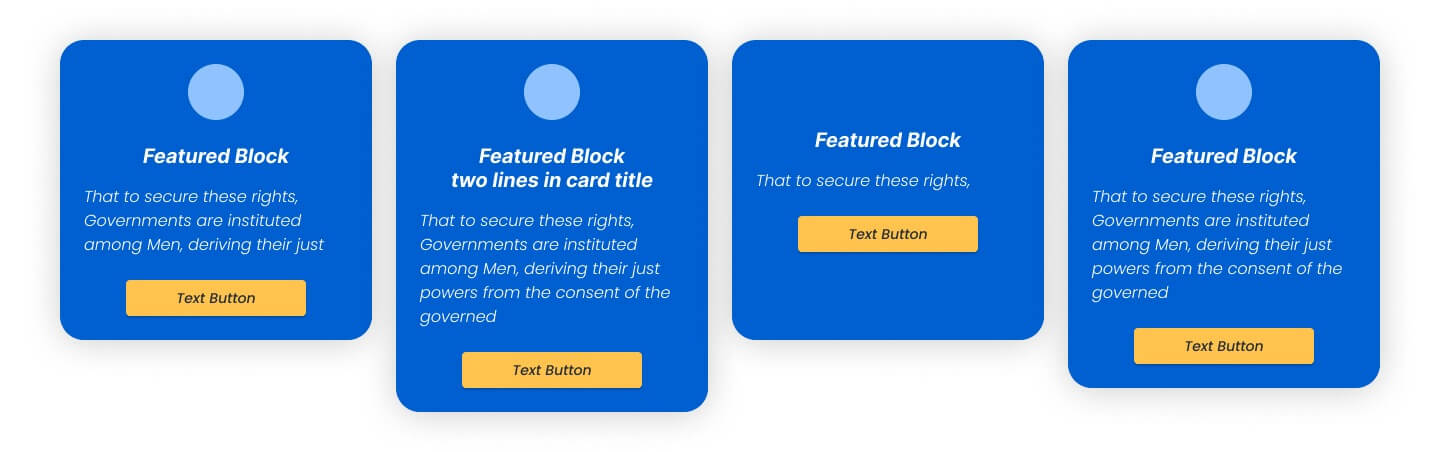
Improving Visual Alignment: Here, we present an illustration of the featured blocks module lacking precise button alignment and a well-defined minimum height. Prior to my involvement, the initial designs failed to consider diverse user scenarios. Given that users have the freedom to populate various elements within a featured block, including the title and icon, the oversight of these conditions could lead to unintended alignment issues, particularly in cases where buttons or card heights resulted in a disjointed appearance.
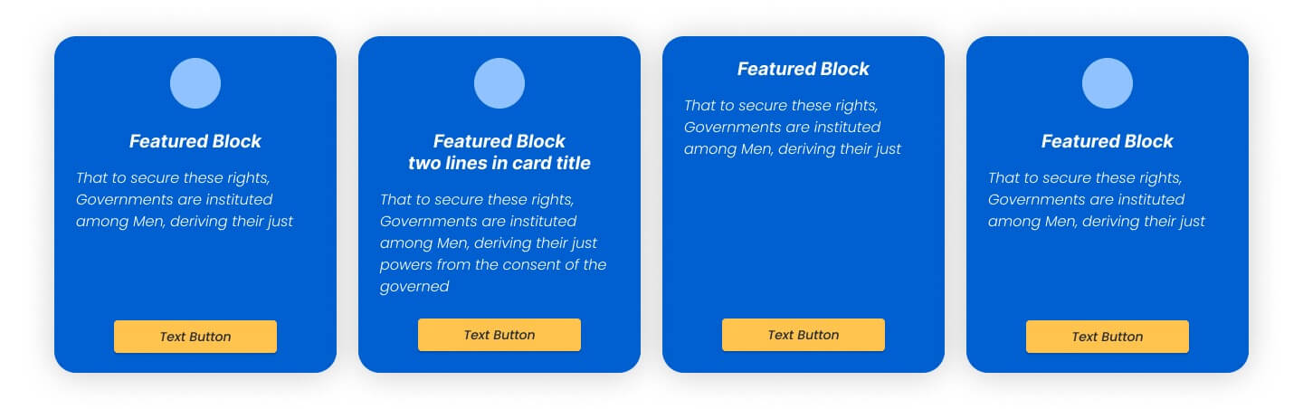
Fixing Visual Balance: To resolve these issues, we implemented specific behavioral guidelines for elements within the featured block. I established a minimum height for the block and precisely defined the alignment and positioning for the title and description elements. Equally important was the determination of button alignment, particularly in cases where the description was of limited length. To achieve uniformity across all scenarios, I positioned the button at the bottom of the block, effectively eliminating the staggered appearance.
The Deliverable
Mirroring the Inspector: This Dev-oriented Design System serves as a dynamic blueprint for digital experiences, seamlessly mirroring the elements typically uncovered in a browser's inspector. It acts as a foundational guidepost for developers, offering clear instructions on the behavior of elements in the HTML and CSS, elucidating the intricacies of margins, padding, and stacking. Moreover, it empowers designers to unleash their creativity by enabling them to effortlessly craft custom themes and skins, affording them the freedom to make precise adjustments to these fundamental building blocks, ultimately sculpting the user experience with finesse.
DEVELOPER ORIENTED WIREFRAMING
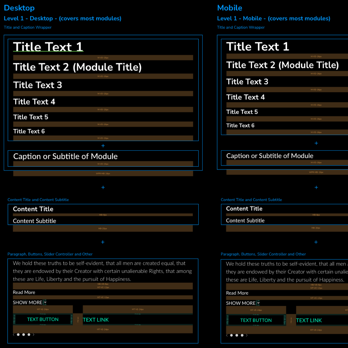
Within sketch, I created similar components to represent margins, paddings, column gutters, section padding, and grids for desktop, tablet, and mobile. I also designed a typography system to accurately portray the necessary stacking to build out any module within the bootstrap framework.
I created instructions for logic and behavior to module settings, layout options, and restrictions for component scalability. This involved multi-layout modules (12-4 columns) with the ability to hide or disable components such as images, text fields, buttons, etc., which ultimately affect a module's height, flexibility, and presentation.
I ensured the creation and delivery of wireframes, development specifications, and design standards.
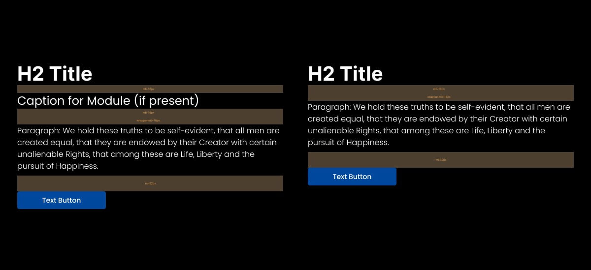
Component Stacking and Spacial Rules
Since all modules have an H2 title and a caption, I came up with a global rule that would maintain proper spacing when the caption is disabled or empty.
The module title and caption show a margin-bottom of 16px. The wrapper underneath the caption also has a margin-bottom of 16px. This results in 32px of space underneath the caption. If the caption was turned off, the title would stack on the items below while maintaining a 32px margin due to the wrapper. In other words, you would have 16px from the module title and 16px from the wrapper.
Defining Responsive Behavior
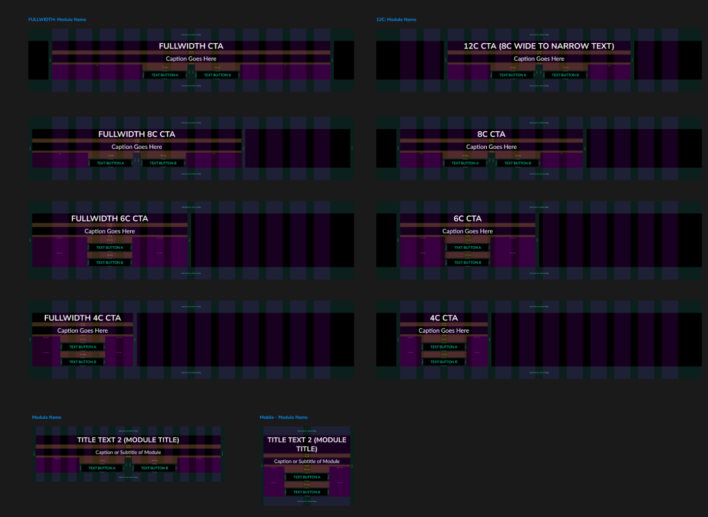
All modules are flexible enough to accommodate a range of column layouts, such as 12, 8, 6, and 4 columns, as well as tablet and mobile screens. These instructions also guarantee that button layouts, initially designed for horizontal stacking, will automatically switch to vertical stacking when there's limited screen real estate available.
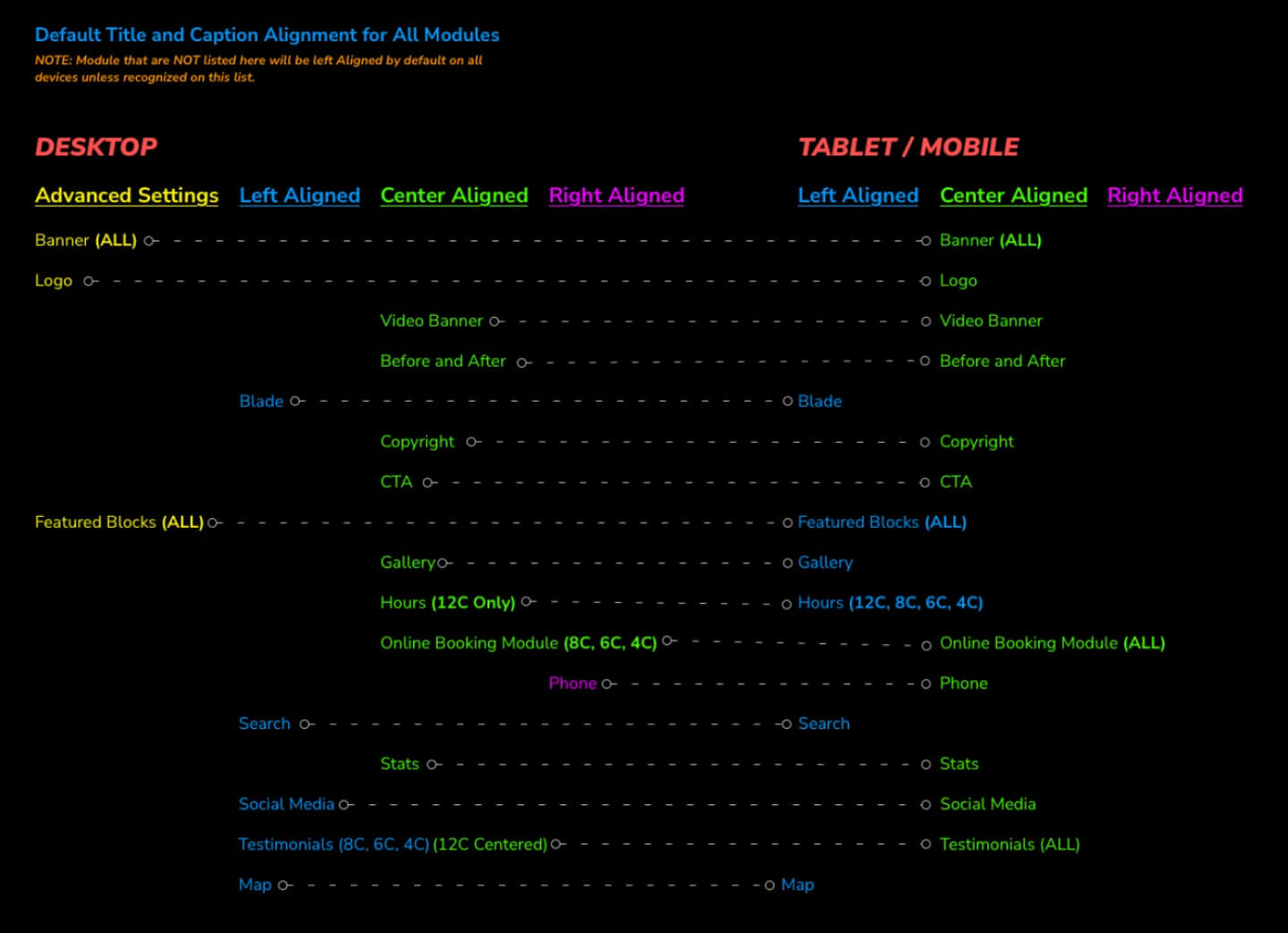
Defining Default Alignment for Titles and Captions
In PLE 1.0, It was never specified how text alignment for title and caption would align by default on desktop vs mobile. I designed a chart to visualize how a title and caption might be left aligned on desktop but center aligned on mobile. The testimonial module shows different conditions where this scenario takes place.
Outcome
These solutions significantly improved the Page Layout Editor (PLE) ecosystem. They enhanced the user experience by rectifying spacing, alignment, and visual consistency issues, ensuring webpages looked more polished and professional. The developer-oriented wireframing system and clear specifications streamlined communication with developers, leading to more efficient and accurate implementation of design elements. The establishment of design standards and responsive behaviors standardized module behaviors and ensured adaptability to various screen sizes and layouts, making PLE more versatile while limiting unexpected bugs. Furthermore, the clarification of default text alignment for titles and captions reduced ambiguity, fostering a cohesive design approach. Overall, these solutions made PLE more user-friendly, improved design consistency, and increased efficiency for both users and developers. This overhaul put a strong technical stake in the ground to ensure future theme templates had a polished structure under the hood.
- UI Enhancements
- UX Enhancements
- Redefined Module Specifications
- Code Cleanup (CSS/SCSS)
- Established a Collaborative Dev Wireframe Kit on Figma
- Defined Responsive Behavior and Multi-column Layout Component Stacking
- Midigated Technical Debt for Future Themes/Templates